 cloudist/ACProgressLite
Download
Step 1. Add the JitPack repository to your build file
Add it in your root settings.gradle at the end of repositories:
	dependencyResolutionManagement {
		repositoriesMode.set(RepositoriesMode.FAIL_ON_PROJECT_REPOS)
		repositories {
			mavenCentral()
			maven { url 'https://jitpack.io' }
		}
	}
Add it in your settings.gradle.kts at the end of repositories:
	dependencyResolutionManagement {
		repositoriesMode.set(RepositoriesMode.FAIL_ON_PROJECT_REPOS)
		repositories {
			mavenCentral()
			maven { url = uri("https://jitpack.io") }
		}
	}
Add to pom.xml
	<repositories>
		<repository>
		    <id>jitpack.io</id>
		    <url>https://jitpack.io</url>
		</repository>
	</repositories>
Add it in your build.sbt at the end of resolvers:
resolvers += "jitpack" at "https://jitpack.io"
Add it in your project.clj at the end of repositories:
:repositories [["jitpack" "https://jitpack.io"]]
Step 2. Add the dependency
	dependencies {
		implementation 'com.github.Cloudist:ACProgressLite:1.2.1'
	}
dependencies {
implementation("com.github.Cloudist:ACProgressLite:1.2.1")
} <dependency>
<groupId>com.github.Cloudist</groupId>
<artifactId>ACProgressLite</artifactId>
<version>1.2.1</version>
</dependency>
libraryDependencies += "com.github.Cloudist" % "ACProgressLite" % "1.2.1"
:dependencies [[com.github.Cloudist/ACProgressLite "1.2.1"]]
Readme
ACProgressLite
 <br/>English Version / 中文版本
An Android loading widget library. Lite and easy to use, strong customizability. Can be used to implement 'iOS' like loading dialog efficiently.
Similar to iOS MBProgressHUD
Keywords Progressbar, Progresswheel, HUD, Android, Loading
Minimum SDK Version: API 9 ( Android 2.3 )
Current Version
- 1.2.1
Usage
- gradle:
compile 'cc.cloudist.acplibrary:library:1.2.1'
Sample Code
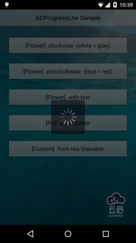
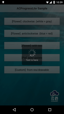
- Flower
ACProgressFlower dialog = new ACProgressFlower.Builder(this)
                        .direction(ACProgressConstant.DIRECT_CLOCKWISE)
                        .themeColor(Color.WHITE)
                        .text("Title is here")
                        .fadeColor(Color.DKGRAY).build();
dialog.show();
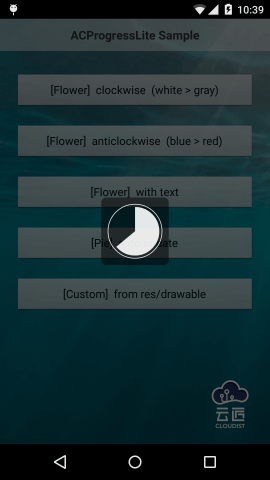
- Pie
ACProgressPie dialog = new ACProgressPie.Builder(this)
                     .ringColor(Color.WHITE)
                     .pieColor(Color.WHITE)
                     .updateType(ACProgressConstant.PIE_AUTO_UPDATE)
                     .build();
dialog.show();
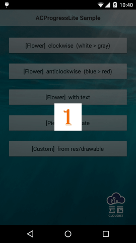
- Custom
ACProgressCustom dialog = new ACProgressCustom.Builder(this)
                        .useImages(R.drawable.p0, R.drawable.p1, R.drawable.p2, R.drawable.p3)
                        .build();
dialog.show();
Configuration
3 types of dialog are avaliable now:<br/>
Here are some general configurations:
1. sizeRatio size of the background. The value is float and less than 1f. It means the ratio of "real size / the smaller edge length of the screen". aka:
background length = the smaller edge length of the screen * sizeRatio
Pay attention to the situation of "Flower type with text", it will be explained int next scetion.
bgColorColor of background, int value.bgAlphaTransparency of background. 0 is full transparency, 1 is opaque. All alpha configurations are similar.bgCornerRadiusRadius of four corners of the background.
bgColor, bgAlpha, bgCornerRadius are not available for custom type
- Flower
Most commonly used type. Support adding text title.
Configuration|Description
:------|:------------------
themeColor|Start color of petals.
borderPadding|Distance between outer edge of petals and edge of background / length of the edge of background. (length of the edge of background is based on sizeRatio)
centerPadding|Distance between inner edge of petals and center of background / length of the edge of background. (length of the edge of background is based on sizeRatio)
fadeColor|End color of petals.
petalCount|Number of petals.
petalAlpha|Transparency of petals.
petalThickness|Thickness of petals.
direction|Direction of petals' rotation, ACProgressConstant.DIRECT_CLOCKWISE or DIRECT_ANTI_CLOCKWISE.
speed|Speed of petals' rotation, frames count in each second.
text|Text, shown under petals.
textSize|Text's size.
textColor|Text's color.
textAlpha|Text's transparency.
textMarginTop|Distance between text and petals.
isTextExpandWidth|Whether expand the background width to equal the height when a text title is set. If you set a text title, the background's height will become longer because of making room for text. If this value is true, the petals are still drawn by sizeRatio, but petals will be horizontally centered as the background's width is expanded to equal the height; if this value is false, the background will be rectangle with different width and height.
- Pie
Suitable for display progress. Manual-update and auto-update are supported.
Configuration|Description
:------|:------------------
ringColor|Color of ring.
ringAlpha|Transparency of ring.
ringThickness|Thickness of ring.
ringBorderPadding|Distance between ring and edge of background / length of the edge of background.
pieColor|Color of pie.
pieAlpha|Transparency of pie.
pieRingDistance|Distance between ring and pie / length of the edge of background.
updateType|Update type. PIE_AUTO_UPDATE or PIE_MANUAL_UPDATE. Manually update with method setPiePercentage().
speed|frames count in each second with auto-update type.
pieces|pieces of pie with auto-update type.
- Custom
like GIF, support res/drawable resources ids array or image files array as data source.
Configuration|Description :------|:------------------ useImages|resources ids array. useFiles|image files array. speed|frames count in each second.
Notice
- Try to clean the project first when you come across any problem.
- use
setCanceledOnTouchOutside(true)in version 1.2.0+ when you want to dismiss the dialog when touch outside. - Most of the methods in
Dialogare supported. - We strongly suggest you to use version above 1.2.0
- If you use version before 1.1.0 (without 1.1.0),and gradle error occured, you can add
tools:ignore="labelunder tagapplicationin Manifest to solve it. - Don not try to use
useImagesanduseFilesat the same time, or only the last calling is avaliable. - Default configuration can perform well under most situations. If you really want to do customization, please tweak carefully to get best visual performance.
- I'm not a native English speaker, there may be some grammar mistakes in this file. Suggestions and corrections are welcome.