 Haixing-Hu/javafx-widgets
Download
Step 1. Add the JitPack repository to your build file
Add it in your root settings.gradle at the end of repositories:
	dependencyResolutionManagement {
		repositoriesMode.set(RepositoriesMode.FAIL_ON_PROJECT_REPOS)
		repositories {
			mavenCentral()
			maven { url 'https://jitpack.io' }
		}
	}
Add it in your settings.gradle.kts at the end of repositories:
	dependencyResolutionManagement {
		repositoriesMode.set(RepositoriesMode.FAIL_ON_PROJECT_REPOS)
		repositories {
			mavenCentral()
			maven { url = uri("https://jitpack.io") }
		}
	}
Add to pom.xml
	<repositories>
		<repository>
		    <id>jitpack.io</id>
		    <url>https://jitpack.io</url>
		</repository>
	</repositories>
Add it in your build.sbt at the end of resolvers:
resolvers += "jitpack" at "https://jitpack.io"
Add it in your project.clj at the end of repositories:
:repositories [["jitpack" "https://jitpack.io"]]
Step 2. Add the dependency
	dependencies {
		implementation 'com.github.Haixing-Hu:javafx-widgets:'
	}
dependencies {
implementation("com.github.Haixing-Hu:javafx-widgets:")
} <dependency>
<groupId>com.github.Haixing-Hu</groupId>
<artifactId>javafx-widgets</artifactId>
<version></version>
</dependency>
libraryDependencies += "com.github.Haixing-Hu" % "javafx-widgets" % ""
:dependencies [[com.github.Haixing-Hu/javafx-widgets ""]]
Readme
javafx-widgets
This project provides some useful components for JavaFX.
Widgets
Action
An Action can be used to separate functionality and state from a control. For example, if you have two or more controls that perform the same function and share the same state (enable, visible, select, graphic, text, style, etc), e.g., one in a Menu and another on a ToolBar, consider using a Action object to implement the function.
An important feature of Actions is, changing the properties (id, css style, text, description, graphic, enable, visible, etc) of an action will automatically changes the same properties of the widgets (buttons, menu items, etc) created from that action, and will automatically refreshes the GUI. Therefore, it very convenient to use actions to manage the behaviours of buttons and menu items in the applicaiton.
The ActionGroup is a special kind of Action, which could contains sub-actions. The button created from an ActionGroup is a MenuButton or SplitMenuButton; and the menu item created from an ActionGroup is a Menu.
The ActionManager could be used to manage all the actions in an application, and it provides convenient functions to access the properties of actions and create MenuBar or ToolBar from actions.
LabelPane
A LabelPane is a trivial Pane which displays a text label on the center. It is usually used for testing layout.
SplitPaneEx
The SplitPaneEx is an extension of SplitPane, with the additional functions to hide or show its children.
Note that due to the limitation of the SplitPane API, it's better to use SplitPaneEx with two children. If SplitPaneEx has more than two children, the size of the child after hidden and shown will be changed unexpectly.
FillPane
A FillPane is a pane implements the SWT's FillLayout. It seems that there is a lack of some common layouts in JavaFX, therefore I have to write them by myself.
CardPane
A CardPane is a simple pane providing the AWT's CardLayout or SWT's StackLayout.
JavaFX provides a StackPane, which at the first look is something like the StackLayout in SWT, but in fact it's a totally different thing. The children added to a StackPane will overlap together, which is not what we except in StackLayout.
The CardPane implements a pane similar to CardLayout or StackLayout, and it could be used to impelement a customized TabPane or WizardPane.
PopOver
This is the PopOver control comes from ControlFX, with a silghtly modification for personal use.

Unlike the PopupControl and Tooltip, the PopOver control can put any controls on its content window.
NoArrowMenuButton
This is an extension of MenuButton without the context menu arrow.

Although it's possible to use CSS styling hack to get rid of the context menu arrow of a menu button, but chaning the default style could affect the appearance of other components, such as Menu and MenuBar. Therfore, I hack the source code of MenuButton and create a NoArrowMenuButton control.
Note that due to the access limitation of Sun's internal packages, the context menu of NoArrowMenuButton cannot support the mnemonics. Also, the code may be broken due to the changes of impelementation details in the future version of JDK.
CustomTextField and CustomPasswordField
This is the controls comes from ControlFX, with a refactor of source codes.
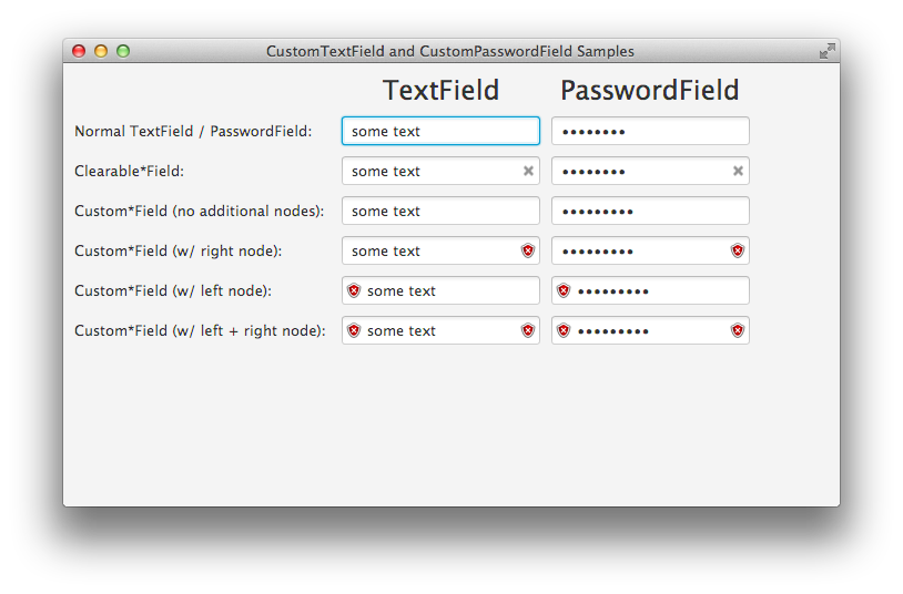
The CustomTextField and CustomPasswordField combines normal TextField or Password with a left node and a right node. The user could customize the left node and right node to provide new features for the text fields.
The following ClearableTextField, ClearablePasswordField, and SearchBox are based on these customized text fields.
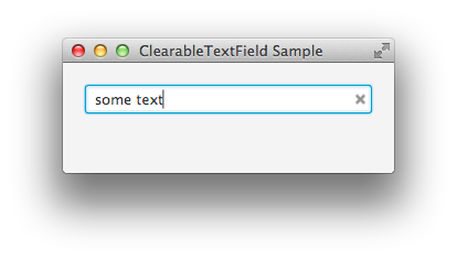
ClearableTextField
This is a simple extension of CustomTextField, providing a clear content button on the right of a TextField.
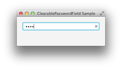
ClearablePasswordField
This is a simple extension of CustomPasswordField, providing a clear content button on the right of a PasswordField.
SearchBox
This is a mac style search box, which is also an extension of CustomPasswordField.

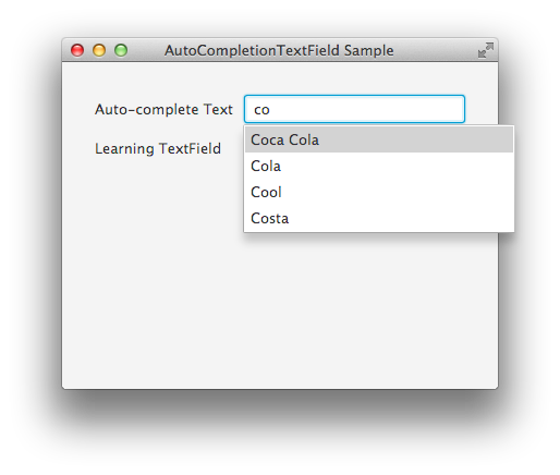
AutoCompletionBinding
This is the controls comes from ControlFX, with a refactor of codes and fixing of bugs.
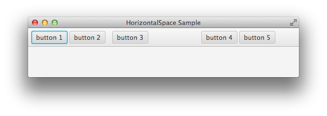
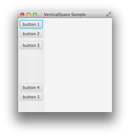
HorizontalSpace and VerticalSpace
These simple widgets are rendered as horizontal or verital spaces.
Others
More widgets will be added when I need them :-)
Dependency
The project depends on the following projects of mine:
- pom-root: which provides configuration of dependent packages for all projects.
- commons: which provides commonly used classes and functions for my personal Java programming.
Build
- Checks out the codes of this project and all its depended projects;
- Build the depended projects in the order of above (building order is important!).
- Build this project.
- All the projects are managed by maven, so the building is as easy as typing
mvn clean install. - By the way, since this project is for the JavaFX 2.0, you should install and configure the JDK 8.0 or above before you play with it.