 appifyhub/actual-number-picker
Download
Step 1. Add the JitPack repository to your build file
Add it in your root settings.gradle at the end of repositories:
	dependencyResolutionManagement {
		repositoriesMode.set(RepositoriesMode.FAIL_ON_PROJECT_REPOS)
		repositories {
			mavenCentral()
			maven { url 'https://jitpack.io' }
		}
	}
Add it in your settings.gradle.kts at the end of repositories:
	dependencyResolutionManagement {
		repositoriesMode.set(RepositoriesMode.FAIL_ON_PROJECT_REPOS)
		repositories {
			mavenCentral()
			maven { url = uri("https://jitpack.io") }
		}
	}
Add to pom.xml
	<repositories>
		<repository>
		    <id>jitpack.io</id>
		    <url>https://jitpack.io</url>
		</repository>
	</repositories>
Add it in your build.sbt at the end of resolvers:
resolvers += "jitpack" at "https://jitpack.io"
Add it in your project.clj at the end of repositories:
:repositories [["jitpack" "https://jitpack.io"]]
Step 2. Add the dependency
	dependencies {
		implementation 'com.github.milosmns:actual-number-picker:'
	}
dependencies {
implementation("com.github.milosmns:actual-number-picker:")
} <dependency>
<groupId>com.github.milosmns</groupId>
<artifactId>actual-number-picker</artifactId>
<version></version>
</dependency>
libraryDependencies += "com.github.milosmns" % "actual-number-picker" % ""
:dependencies [[com.github.milosmns/actual-number-picker ""]]
Readme
Actual Number Picker
What is this?
Actual Number Picker is an Android custom-built View for choosing numbers. It's simple, elegant, fits in a small-height constraint box and it can be completely customized in XML. You can easily swipe it right and left, or click on arrow controls to increase/decrease the current value.
Requirements
- Android 3.0 or later (Minimum SDK level 11)
- Android Studio (to compile and use)
- Eclipse is not supported
Getting Started
- Download Android Studio
- Launch Android Studio
- Start your new project
- Open your project's main Gradle file, in root directory (/build.gradle)
- Make sure you are using jcenter() in the repository block (mavenCentral() should work too)
- Open your app module Gradle file, for example /app/build.gradle
- In dependencies block, add the following line:
compile 'me.angrybyte.picker:picker:1.3.1' - Click Tools/Android/Sync Project with Gradle Files or click on the Sync icon in the top toolbar
- Click Run/Run 'app' to see if it's resolved correctly
This will run the app on your device. You may need to download a newer version of Gradle, which will be available in the Android Studio UI if compile fails.
What does it look like?
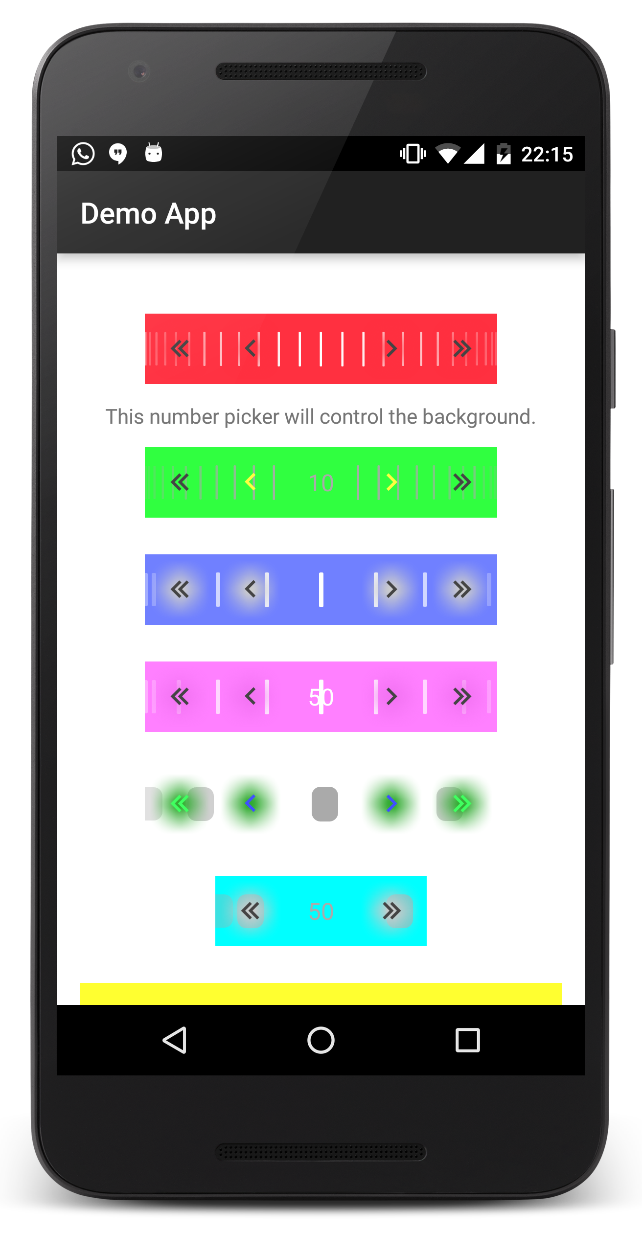
 A Lollipop-inspired look
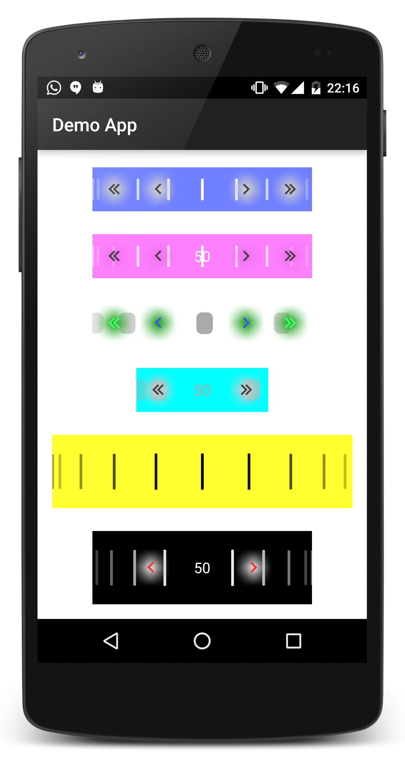 Various configuration options (v1)
 Various configuration options (v2)
Sample usage
First, define the View in your layout file (of course, you don't need to add all the app attributes, I just added them for demo).
<me.angrybyte.numberpicker.view.ActualNumberPicker
    android:id="@+id/actual_picker"
    android:layout_width="wrap_content"
    android:layout_height="48dp"
    android:layout_centerHorizontal="true"
    android:layout_marginTop="25dp"
    android:background="#FFFF3040"
    app:bar_color="@android:color/white"
    app:bar_width="1dp"
    app:bars_count="26"
    app:controls_color="@android:color/white"
    app:draw_over_controls="true"
    app:draw_over_text="false"
    app:fast_controls_color="@android:color/darker_gray"
    app:highlight_color="#FFFF3040"
    app:max_value="100"
    app:min_value="0"
    app:selection_color="#A0FF3040"
    app:show_bars="true"
    app:show_controls="true"
    app:show_fast_controls="true"
    app:show_highlight="true"
    app:show_text="false"
    app:text_color="@android:color/white"
    app:text_size="16sp"
    app:value="50" />
Then, from Java (your Activity or Fragment), you can easily get the view and attach the listener.
public class DemoActivity extends AppCompatActivity implements OnValueChangeListener {

    private static final String TAG = DemoActivity.class.getSimpleName();

    private ActualNumberPicker mPicker;

    @Override
    protected void onCreate(Bundle savedInstanceState) {
        super.onCreate(savedInstanceState);
        setContentView(R.layout.activity_demo);
        mPicker = (ActualNumberPicker) findViewById(R.id.actual_picker);
        mPicker.setListener(this);
    }

    @Override
    public void onValueChanged(int oldValue, int newValue) {
        float percent = (float) newValue / (float) (mPicker.getMaxValue() - mPicker.getMinValue());
        Log.d(TAG, "Currently the picker is at " + percent + " percent.");
    }

}
Note: onValueChanged() event will always get fired on the UI thread.
Explanation of attributes
Here are some short explanations for the attributes provided by the view. You can leave out any of them, values will get set to default ones.
show_bars: (boolean) Whether show the vertical lines or not.bars_count: (integer) How many bars to show. Note that the number may be changed by 1 if symmetry issues occur (ignored if bars are not visible).bar_color: (color) Recolors all of the vertical lines to the specified color (ignored if bars are not visible).bar_width: (dimension) How wide should each bar be (ignored if bars are not visible).draw_over_text: (boolean) Whether to show the bars over the text (ignored if text or bars are not visible).-
draw_over_controls: (boolean) Whether to show the bars over the arrow controls (ignored if controls or bars are not visible). -
selection_color: (color) The touch highlight color on each of the arrow controls (ignored if controls are not visible). -
show_highlight: (boolean) Whether to show the blurry highlight behind each of the arrow controls (ignored if controls are not visible). -
highlight_color: (color) Recolors the blurry highlight to the specified color (ignored if controls or highlights are not visible). -
show_controls: (boolean) Whether to show the slow arrow controls or not. -
controls_color: (color) Recolors all of the slow arrows to the specified color (ignored if slow arrows are not visible). -
show_fast_controls: (boolean) Whether to show the fast arrow controls or not. -
fast_controls_color: (color) Recolors all of the fast arrows to the specified color (ignored if fast arrows are not visible). -
show_text: (boolean) Whether to show the text with the current number value or not. text_size: (dimension) Set the current number value text size (ignored if text is not shown).-
text_color: (color) Recolors the current number value text to the specified color (ignored if text is not shown). -
min_value: (integer) How low can the value numbers go. max_value: (integer) How high can the value numbers go.value: (integer) Set the current value (must be betweenmin_valueandmax_value).
Support
If you've found an error while using the library, please file an issue. All patches are encouraged, and may be submitted by forking this project and submitting a pull request through GitHub. Some more help can be found here: