 red1004g/PagerSlidingTabStrip
Download
Step 1. Add the JitPack repository to your build file
Add it in your root settings.gradle at the end of repositories:
	dependencyResolutionManagement {
		repositoriesMode.set(RepositoriesMode.FAIL_ON_PROJECT_REPOS)
		repositories {
			mavenCentral()
			maven { url 'https://jitpack.io' }
		}
	}
Add it in your settings.gradle.kts at the end of repositories:
	dependencyResolutionManagement {
		repositoriesMode.set(RepositoriesMode.FAIL_ON_PROJECT_REPOS)
		repositories {
			mavenCentral()
			maven { url = uri("https://jitpack.io") }
		}
	}
Add to pom.xml
	<repositories>
		<repository>
		    <id>jitpack.io</id>
		    <url>https://jitpack.io</url>
		</repository>
	</repositories>
Add it in your build.sbt at the end of resolvers:
resolvers += "jitpack" at "https://jitpack.io"
Add it in your project.clj at the end of repositories:
:repositories [["jitpack" "https://jitpack.io"]]
Step 2. Add the dependency
	dependencies {
		implementation 'com.github.red1004g:pagerslidingtabstrip:'
	}
dependencies {
implementation("com.github.red1004g:pagerslidingtabstrip:")
} <dependency>
<groupId>com.github.red1004g</groupId>
<artifactId>pagerslidingtabstrip</artifactId>
<version></version>
</dependency>
libraryDependencies += "com.github.red1004g" % "pagerslidingtabstrip" % ""
:dependencies [[com.github.red1004g/pagerslidingtabstrip ""]]
Readme
Android PagerSlidingTabStrip
This is forked by astuetz/PagerSlingTabStrip.
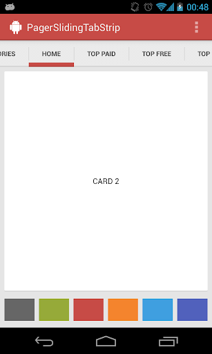
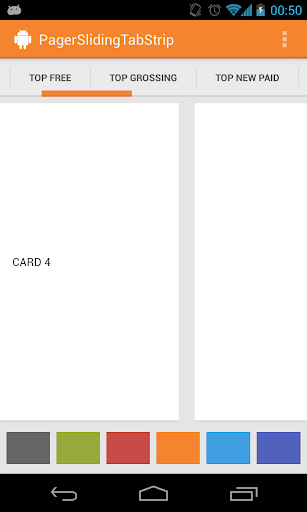
Interactive paging indicator widget, compatible with the ViewPager from the
Android Support Library.
Try out the sample application on the Play Store.

Usage
For a working implementation of this project see the sample/ folder.
-
Include the library as local library project or add the dependency in your build.gradle.
dependencies { compile 'com.astuetz:pagerslidingtabstrip:1.0.1' } -
Include the PagerSlidingTabStrip widget in your layout. This should usually be placed above the
ViewPagerit represents.<com.astuetz.PagerSlidingTabStrip android:id="@+id/tabs" android:layout_width="match_parent" android:layout_height="48dip" /> -
In your
onCreatemethod (oronCreateViewfor a fragment), bind the widget to theViewPager.// Initialize the ViewPager and set an adapter ViewPager pager = (ViewPager) findViewById(R.id.pager); pager.setAdapter(new TestAdapter(getSupportFragmentManager())); // Bind the tabs to the ViewPager PagerSlidingTabStrip tabs = (PagerSlidingTabStrip) findViewById(R.id.tabs); tabs.setViewPager(pager); -
(Optional) If you use an
OnPageChangeListenerwith your view pager you should set it in the widget rather than on the pager directly.// continued from above tabs.setOnPageChangeListener(mPageChangeListener); -
(Optional) If you want to
change tab title colorwhen selected you should set attributes in the xml. (Added)<RelativeLayout xmlns:android="http://schemas.android.com/apk/res/android" xmlns:app="http://schemas.android.com/apk/res-auto" xmlns:tools="http://schemas.android.com/tools" android:layout_width="match_parent" android:layout_height="match_parent" > <com.astuetz.PagerSlidingTabStrip android:id="@+id/tabs" android:layout_width="match_parent" android:layout_height="48dp" app:pstsTabSwitch="true" app:pstsActivateTextColor="#FF666666" app:pstsDeactivateTextColor="#FFCCCCCC" /> ... </RelativeLayout> -
(Optional) If you want to
change tab icon imagewhen selected you should set pstsTabSwitch attribute in the xml and preparedrawable selector. (Added)<com.astuetz.PagerSlidingTabStrip android:id="@+id/tabs" android:layout_width="match_parent" android:layout_height="48dp" app:pstsTabSwitch="true" /> ...
Customization
To not just look like another Play Store styled app, go and adjust these values to match your brand:
pstsIndicatorColorColor of the sliding indicatorpstsUnderlineColorColor of the full-width line on the bottom of the viewpstsDividerColorColor of the dividers between tabspstsIndicatorHeightHeight of the sliding indicatorpstsUnderlineHeightHeight of the full-width line on the bottom of the viewpstsDividerPaddingTop and bottom padding of the dividerspstsTabPaddingLeftRightLeft and right padding of each tabpstsScrollOffsetScroll offset of the selected tabpstsTabBackgroundBackground drawable of each tab, should be a StateListDrawablepstsShouldExpandIf set to true, each tab is given the same weight, default falsepstsTextAllCapsIf true, all tab titles will be upper case, default truepstsTabSwitchWhen a tab is selected, the drawable selector icon or the text color of the Tab title can be modified (Added)pstsTextActivateColorThe Title color of selected Tab (Added)pstsTextDeactivateColorThe Title color of unselected Tabs (Added)
All attributes have their respective getters and setters to change them at runtime
Changelog
Current Version: 1.0.1
1.0.1
- Upgraded gradle build files
- Changed package name to
com.astuetz.PagerSlidingTabStrip - #37, #41 Added
pstsprefix to all attributes inattrs.xml - #46 Changed the shouldExpand behavior to set the layout at the time the tab is added
Developed By
- Andreas Stuetz - andreas.stuetz@gmail.com
Credits
- Kirill Grouchnikov - Author of an explanation post on Google+
License
Copyright 2013 Andreas Stuetz

Licensed under the Apache License, Version 2.0 (the "License");
you may not use this file except in compliance with the License.
You may obtain a copy of the License at

   http://www.apache.org/licenses/LICENSE-2.0

Unless required by applicable law or agreed to in writing, software
distributed under the License is distributed on an "AS IS" BASIS,
WITHOUT WARRANTIES OR CONDITIONS OF ANY KIND, either express or implied.
See the License for the specific language governing permissions and
limitations under the License.