 viniciusmo/Circle-Progress-View
Download
Step 1. Add the JitPack repository to your build file
Add it in your root settings.gradle at the end of repositories:
	dependencyResolutionManagement {
		repositoriesMode.set(RepositoriesMode.FAIL_ON_PROJECT_REPOS)
		repositories {
			mavenCentral()
			maven { url 'https://jitpack.io' }
		}
	}
Add it in your settings.gradle.kts at the end of repositories:
	dependencyResolutionManagement {
		repositoriesMode.set(RepositoriesMode.FAIL_ON_PROJECT_REPOS)
		repositories {
			mavenCentral()
			maven { url = uri("https://jitpack.io") }
		}
	}
Add to pom.xml
	<repositories>
		<repository>
		    <id>jitpack.io</id>
		    <url>https://jitpack.io</url>
		</repository>
	</repositories>
Add it in your build.sbt at the end of resolvers:
resolvers += "jitpack" at "https://jitpack.io"
Add it in your project.clj at the end of repositories:
:repositories [["jitpack" "https://jitpack.io"]]
Step 2. Add the dependency
	dependencies {
		implementation 'com.github.viniciusmo:Circle-Progress-View:v1.4'
	}
dependencies {
implementation("com.github.viniciusmo:Circle-Progress-View:v1.4")
} <dependency>
<groupId>com.github.viniciusmo</groupId>
<artifactId>Circle-Progress-View</artifactId>
<version>v1.4</version>
</dependency>
libraryDependencies += "com.github.viniciusmo" % "Circle-Progress-View" % "v1.4"
:dependencies [[com.github.viniciusmo/Circle-Progress-View "v1.4"]]
Readme
CircleView
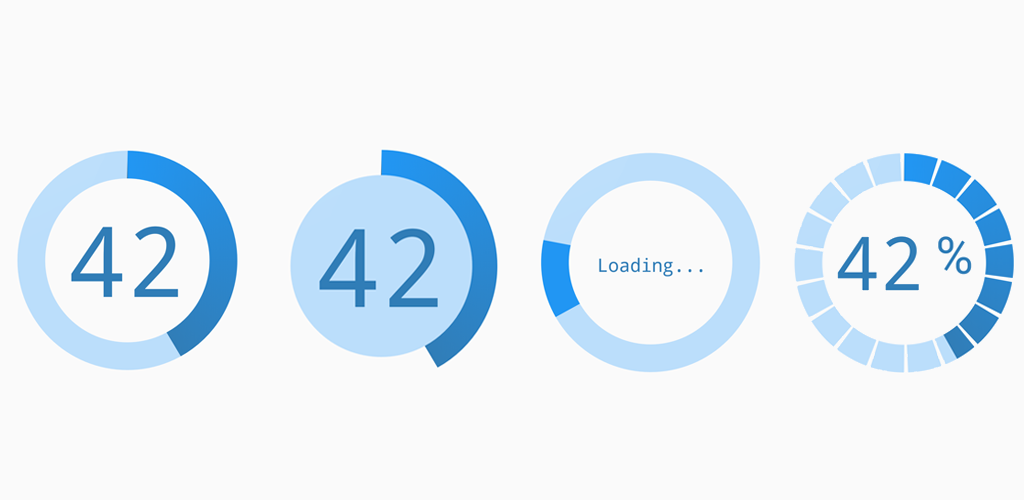
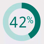
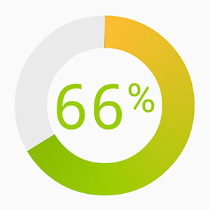
An animated circle view. Can be used in 'value mode' or 'spinning mode'. Nice transitions between spinning and value. Can be used as a loading indicator and to show progress or values in a circular manner. In seek mode, it can also be used to set a value.
Try it out here.
Fully animated:
- Animated set value.
- Spinning mode.
- Transition from spinning mode to value mode.
Fully customizable:
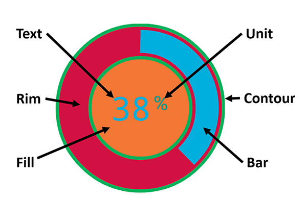
All parts come with a customizable color and thickness. Set the size of a part to 0 to hide it.
Text sizes
Per default, the texts size is automatically calculated to fit in the circle.
Colors
The spin bar color can consist of a single color or a gradient from up to 4 colors.
Block Mode
- Via XML
CircleProgressView:cpv_blockCount="18"
CircleProgressView:cpv_blockScale="0.9"
Seek Mode
Set value on touch input. Enable it:
- Via Code:
circleview.setSeekModeEnabled(true);
- Via XML:
CircleProgressView:cpv_seekMode="true"
For more examples take a look at the example app.
Add it to your project:
Get the latest release from https://jitpack.io/#jakob-grabner/Circle-Progress-View
allprojects {
    repositories {
        // ...
        maven { url "https://jitpack.io" }
    }
}

dependencies {
	// ...
        compile 'com.github.jakob-grabner:Circle-Progress-View:v1.3'
}
JavaDoc
Get it here.